
In Abington, more homeowners are choosing two-tone decks for their ability to bring structure and contrast to outdoor spaces. These color schemes use visual separation to define activity zones, highlight transitions, and support long-term durability. With the area’s mix of historic and modern homes, multi-tonal deck layouts also offer flexibility in matching existing architecture.
Why Two-Tone Decks Are Popular in Abington

Using two different decking colors isn’t just about contrast—it’s a practical design tool. From minimizing maintenance needs to improving usability, color variation is functional in how a deck looks and performs over time.
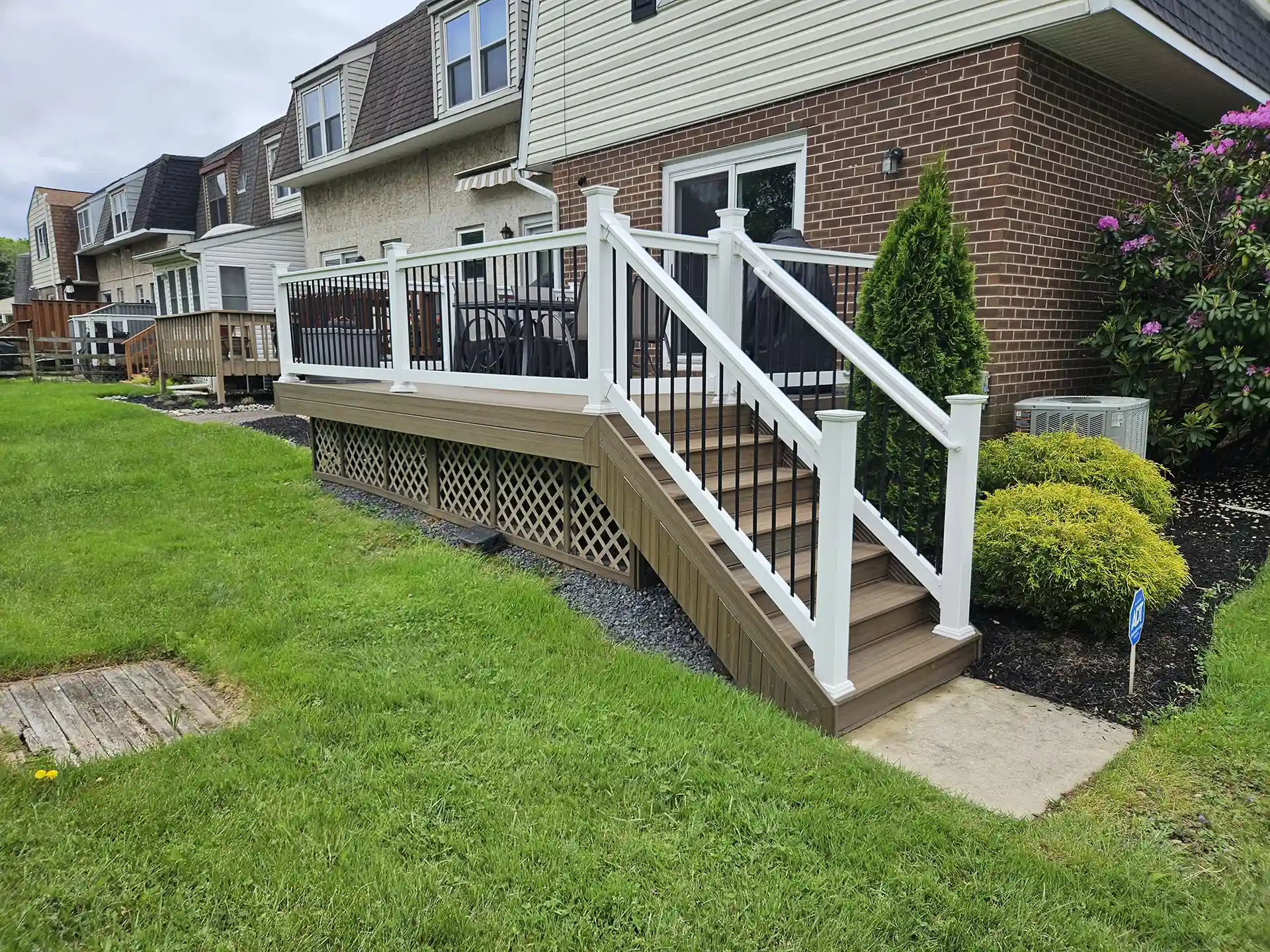
Blends modern design with local architecture: The contrast between light and dark decking boards creates a polished, contemporary look that complements the traditional homes found throughout Abington.
Defines outdoor zones without walls: A two-tone deck naturally separates lounging, cooking, or dining areas through color changes, helping organize the layout without physical dividers.
Improves comfort in four-season climates: Lighter boards reflect heat and are cooler on bare feet in summer, while darker tones help conceal seasonal debris and wear from frequent foot traffic.
Highlights craftsmanship and design features: Local deck installers use two-tone designs to draw attention to picture frame borders, inlays, and multi-level transitions.
Supports durability with smart color placement: Deck contractors in Abington often recommend darker tones in high-use areas like stairs and pathways, helping extend the appearance of a new build between maintenance cycles.
How Two-Tone Deck Color Schemes Improve Deck Performance
Two-tone decks aren’t just about looks—they also improve how a deck functions and holds up over time. Choosing the correct color layout can help with maintenance, comfort, and visual organization.
- Hides wear in high-traffic areas: Darker boards on stairs, near doors, or around grills help conceal dirt, scuffs, and stains. Brown two-tone deck designs are often used in these spots for durability.
- Helps define separate zones: Different board colors can mark off areas for dining, lounging, or walking. Common two-tone deck ideas include border layouts or inlays that separate zones without adding built-in dividers.
- Improves balance on large decks: Using two colors breaks up the surface visually, making big decks feel more proportioned. Deck contractors often recommend this on wide composite layouts to avoid a flat, single-tone appearance.
- Matches the home’s style: A grey two-tone deck works well with modern homes, while warmer combinations suit more traditional designs. Aligning the deck colors with your home’s architecture creates a more cohesive outdoor space.
- Supports low-maintenance use: Two-tone composite deck materials resist fading, stains, and wear. They’re reliable for homeowners looking for function and customization without frequent upkeep.
How to Choose the Right Colors for a Two-Tone Deck
A two-tone deck works best when the color choices are planned around your home’s exterior, the space used, and long-term maintenance. Deck builders in Abington recommend considering contrast and practicality when finalizing your layout.
Coordinate with siding and trim: Two-tone deck color schemes should reflect the tones already used on your home. For example, a brown two-tone deck using cedar and walnut pairs well with beige siding or brick.
Test your options outside: Deck contractors suggest placing sample boards in natural light before making a final decision. Colors that look similar indoors can appear very different in sunlight or shade.
Think about how you use the space. For areas with high foot traffic, choose darker boards to hide wear. Strategic board placement introduces subtle visual breaks that guide movement and function.
Include the railing in your plan: Two-tone deck railing options, such as black balusters with white posts, give structure to the perimeter and complement composite decking. Coordinating railing colors can help tie together multi-level builds.
Balance appearance with maintenance: Two-tone deck stain ideas often use a lighter main surface with a darker border to reduce visible dirt while keeping the deck bright and open. Two-tone composite deck products make this easier with consistent factory finishes and low upkeep.
How to Arrange Colors in a Two-Tone Deck Design
How colors are arranged on a two-tone deck can impact the appearance and function of the entire structure. Deck installers in Abington commonly use these layout techniques to create visual boundaries, guide foot traffic, and highlight craftsmanship.
Two-tone deck color schemes are most effective with thoughtful layout choices. From railing systems to fascia boards, every component offers a chance to emphasize contrast or create cohesion.
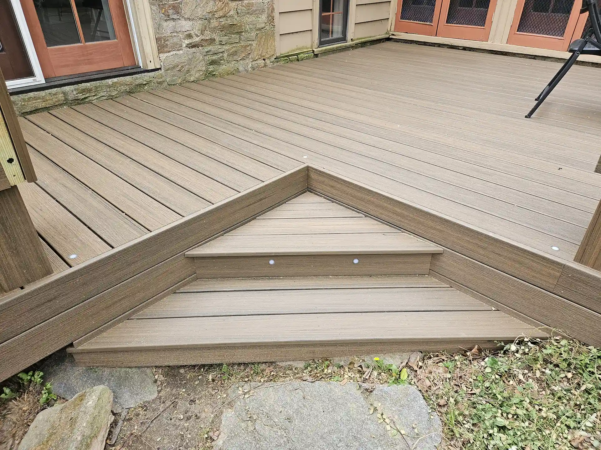
Deck Board Color Combinations
The way deck boards are arranged—and how their colors interact—can transform the look and function of a deck. Layout patterns define edges, add contrast, and support long-term durability in two-tone deck color schemes.
Deck builders in Abington tailor board placement to the style of the home, using multi-tonal layouts that feel intentional and low-maintenance.
Mention Inlay Design
- Use inlays to create visual contrast: Inlays incorporate a second board color to form patterns or highlight focal areas. Two-tone composite deck projects often use dark inlays inside lighter board fields to add interest without overcomplicating the layout.
- Best for large surfaces: Inlays are typically centered in main areas or placed between distinct zones to guide movement or anchor furniture groupings.
Picture Frame Border
- Frame the deck with high contrast: This layout uses a darker border around the lighter central field to define the edge of the deck. It’s one of the most common two-tone deck color schemes for aesthetic and performance reasons.
- Example pairings: A brown two-tone deck may use cedar for the main field and chocolate fascia as the picture frame. For composite decks, brands like Trex and TimberTech offer matched systems in these tones.
Assortment Layout
- Alternate colors in a pattern: A layout that uses light and dark boards in a chevron, herringbone, or staggered design introduces movement and visual variety.
- Ideal for large decks: This helps break up large surfaces so they don’t feel flat or oversized. Grey two-tone deck ideas often use this layout with light silver and charcoal boards to create a sleek, modern look.
Best Skirting and Fascia Color Pairings for Two-Tone Decks
Fascia boards and skirting panels offer more than just a finished edge—they’re essential design elements supporting a two-tone deck’s overall look. These components also serve practical functions by protecting the frame and providing airflow underneath the deck structure.
Use darker tones to anchor the structure:
This approach is common in brown two-tone deck projects, where chocolate or espresso tones frame lighter decking boards.
Contrast with the main decking surface:
Two-tone composite deck installations use light-to-medium field boards paired with a darker fascia or skirt for contrast. This adds visual interest and defines the edge of the structure without interrupting the deck surface.
Match fascia to rail components or borders:
For design continuity, some deck builders coordinate fascia boards with the railing posts or picture frame border. Two-tone deck color schemes using this technique feel cohesive and intentional.
Keep skirting simple for ventilation:
While lattice or solid panel skirting can be painted to match fascia, choosing a subtle color that won’t compete with the deck is best. Two-tone deck stain ideas keep skirting low-profile to let the top structure stand out.
Use composite for consistency and longevity:
Composite fascia boards come in the same colors and finishes as decking materials. This ensures a perfect match, reduces maintenance, and keeps the edges of the deck looking sharp season after season.
Best Composite Decking Options for Two-Tone Designs
Composite materials make two-tone decks easier to plan, install, and maintain. Many product lines offer pre-finished boards in coordinated colors, which allows deck contractors to create a strong visual contrast without additional staining or sealing.
Trex Transcend: Popular for two-tone Trex decking designs, this line includes colors like Spiced Rum and Gravel Path, often used together for warm, natural contrast. These combinations are frequently chosen by deck builders for homeowners looking to match earth tones in siding or landscaping.
Deckorators Voyage: Known for its mineral-based core and minimal thermal movement, this series is often used in two-tone composite deck builds. Colors like Tundra and Dark Slate provide reliable durability with high slip resistance, even in wet conditions.
TimberTech Reserve: This collection uses shades like Storm Gray and Dark Roast to support bold two-tone deck color schemes. Deck installers often recommend this pairing for clients who want visual depth with a low-maintenance surface.
Match border and field boards from the same product line: Many deck companies suggest choosing main boards and picture frame accents from a single brand to ensure color compatibility and performance. Composite boards are manufactured to maintain consistent hue and finish across batches.
Use sample kits for planning: Deck construction professionals use color sample kits to test combinations under different lighting conditions. These kits are beneficial for confirming the contrast level of brown two-tone deck ideas or grey two-tone deck layouts.
Color Combination Ideas for Two-Tone Decks
| Two-Tone Design Concept | Idea |
|---|---|
| Brown Deck | Use saddle or cedar boards for dark walnut or chocolate borders on the main field. |
| Grey Deck | Pair light slate or silver boards with charcoal or storm gray for a modern, balanced look. |
| Trex Decking Designs | Combine Island Mist with Lava Rock from Trex Transcend for consistent texture and tone. |
| Composite Layout | Use light field boards with dark borders from the same composite line to ensure cohesion. |
| Painting Approach | Apply a solid stain to the fascia and risers and a semi-transparent finish to the decking surface. |
| Railing Options | Choose white posts with black balusters or bronze rails with tan posts for visual contrast. |
| Color Schemes | Try complementary tones like taupe and brown or bold contrast with driftwood and charcoal. |
| Stain Strategies | Use solid color stain on the outer framing and semi-transparent on the main surface for subtle depth. |
Build a Two-Tone Deck That Fits the Way You Live
A two-tone deck does more than frame your backyard—it shapes how you relax, gather, and move through the space. The right color layout can separate dining areas from lounge zones, reduce visible wear, and complement your home’s architecture.
Back to Nature helps Abington homeowners design two-tone composite decks that feel intentional, low-maintenance, and built for daily use. Whether you’re drawn to clean grey contrasts or warm brown border accents, our team will walk you through the color combinations and material options that match your style and space.
Ready to build a deck that looks sharp and works hard? Contact Back to Nature for a free consultation.
